3 Essential Design Trends, October 2024
Ever struggled to create a visually engaging design with limited assets?
Designers often need to get creative when working with minimal photos or videos.
This month, we’re highlighting three design trends that showcase how to overcome these challenges.
Here’s what’s trending in design:

1. Homepages with Typography Focus
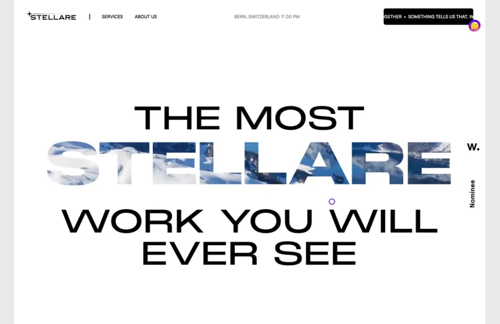
Typography is often the star of the show when other design elements are limited. There are countless ways to use text to capture attention and tell a compelling story online. The key to this trend is responsive design. You need to ensure that text elements look great and are easy to read on all devices. This can be trickier than it seems. The payoff is clear. Users instantly understand the purpose of your website because the text is prominent and informative. Stellare cleverly uses its brand name with a color/background motion effect and a pun to grab attention. This works because the design is simple. You don’t need to understand the background video to get the message. The text is easy to read and focuses on one key word.
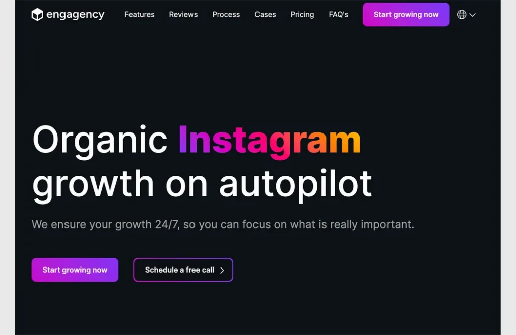
Engagency is also an agency, but it takes a unique approach to a typography-focused homepage. They use a high-contrast design with a dark background and stark white text. They also emphasize a single word with a colorful gradient to draw attention.
2. Overlapping Elements
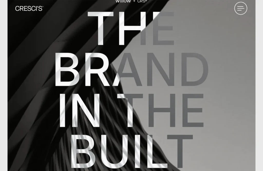
If you’re missing a crucial image, consider using space creatively or allowing elements to overlap. This technique can be challenging to achieve on different screen sizes but can create a stunning visual effect when done well. Overlapping elements can include text and background elements, images or videos and text, or even small illustrations or animations. When designing with this trend, ensure that elements interact effectively so that text remains readable and important information isn’t obscured. Cresci’s uses an overprint effect to make text elements appear to blend into the background. The stark homepage design, combined with texture, oversized text, and the overall effect, is definitely eye-catching.
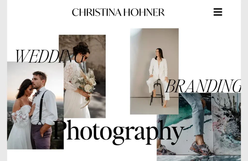
Christina Hohner combines images and text in creative ways to showcase her skills and services.
3. Ways to Show AI
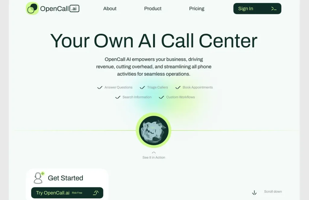
The Challenge of Visualizing AI: From Robots to Subtle Tech
For months, we’ve seen a shift in how designers represent artificial intelligence (AI). Initially, trends leaned towards robotic figures and text-heavy explanations.
Lately, the focus has moved away from giving AI a “face” and towards a more subtle approach that emphasizes the technology’s high-tech nature.
OpenCall.ai exemplifies this shift. They use a minimalist animation, possibly resembling a soundwave, to represent their AI. The power lies in the surrounding text which clearly explains the technology, making the image secondary. This design choice reinforces the idea that AI can be powerful without needing a literal representation.

Walbi combines two effects to highlight their AI: a unique text treatment on certain letters/words and a green pulsing element. The pulsing element is becoming a popular way to visually represent artificial intelligence “thinking.
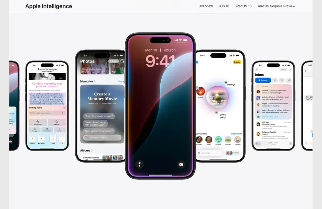
Apple is getting in on the AI game with “Apple Intelligence.” The landing page shows different elements that iOS is using AI to make your life better. Some of the screens may be recognizable, while others are previewing something new in an upcoming update. This example is the closest to showing AI in action of any of the above, but it also requires the user to already have some familiarity and connect some dots on their own as well.
Conclusion
The most intriguing trend is the last one. While the first two have been popular in the past, showcasing AI is a relatively new concept. How do you visually represent computer processing?
It’s a challenging task, but thinking creatively can help. Could you come up with a unique way to depict AI, or borrow an idea you’ve seen elsewhere? It’s something to ponder before such a project comes your way.
Category:
- Web Design Trends
Share :
